Resources:
One of the common visualization techniques is to build a directed or undirected graph of relationships. This lab will explore that technique.We will primarily focus this lab on the Gephi and Graphviz visualization tools. Both of these tools are open-source and cross-platform, making them very useful for a variety of projects. Gephi will also (partially) import data from Graphviz, making them interoperable tools.
Graphviz is a series of products created initially by AT&T Labs
Research. The primary tool is called dot, which is both a
tool and a language for represented graphs, subgraphs and clusters (the
DOT language). We will focus the first part of the lab on learning the DOT
language. Start by reading the following tutorial:
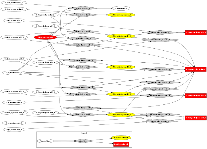
The lovely thing about the DOT language is that you can easily write a program to take a data file and convert it into a DOT file. All that is required is a programmatic method to set the node and edge attributes. Here is some sample code extracted from my attack graph tool that shows how the attack graph tool generates the output file in the DOT language. The following is an example of output generated by the attack graph code, and the PNG file generated by
dot from the DOT file:
DOT file
The DOT language supports a wide range of subgraphs, clusters, and graph layouts. The above graph is a type of source-sink graph, but we could have also generated random layouts, clusters, and so forth. The user guide has additional examples. When the user needs direct control over the placement of nodes, Graphviz is very useful as it provides ways to rank nodes and group nodes into the same rank.
Gephi is another open-source tool for visualizing graphs. It was originally developed by students at a French university. Gephi excels in visualizing data that is too dense to have information conveyed solely through edges, labels and layouts. It makes use of colors, node sizes, edge sizes, clustering, and layouts to convey information about relationships.
Gephi provides an interactive GUI to manipulate the graph. It reads files
in the DOT format, although it does not perfectly understand the DOT language.
It primarily understands the node label and color attributes, although even
that is not perfect. For example, red filled nodes in DOT are indicated by
style=filled, fillcolor=red but Gephi only understands
color=red. Gephi also does not properly read subgraphs and will
merge those nodes into the overall graph. DOT attributes that Gephi does not
support may still be listed in the node attribute table, but will not affect
the layout of the graph.
For example, to deal with the differences between dot and
Gephi, attack_graph_example.orig.dot
would need to be modified to remove node shapes and to change the
fillcolor attributes to color attributes. In the
following file, such modifications were made:
attack_graph_example.modified.dot
In the modified file, the nodes have a color and a cluster
attribute instead of a shape to indicate node type.
Download this modified file and open it with Gephi. Play around with Gephi
options to see how they affect the file. Notice that the Gephi output differs
from the above dot output since dot was directed to
produce a source-sink graph ordered from left to right, while Gephi defaults
to a random layout.
Read the Gephi tutorials for more
information about how to use the Gephi interface.
In the Notes section on Moodle or as a separate file, describe your dataset, how you visualized it, and the size of your resulting file. Do this description even if you were able to upload the image file, but it is particularly important if you were not able to upload the image file.